Letterpress and Color Subjectivity: How Pantone Guides the Way
by Rebecca Cooper -
“If we were to imagine an orange on the blue side or a violet on the yellow side, it would give us the same impression as a North wind coming from the Southwest.”
—Ludwig Wittgenstein
Color is a vast topic, and one we think a lot about here at Hoban Press. As Mr. Wittgenstein adroitly stated: color is subjective; descriptions of color are subjective. Our individual perceptions of color are influenced by a complex tapestry of life experiences, associations, and cultural environment. They are influenced by light, and by the colors that surround them: color rarely stands alone. Descriptions of color and relationship to it are as individual as we are. From an anthropological perspective, this is thrilling stuff. But from a design perspective, the waters can get a little murky between client and designer, proof and printer, without a common language to discuss the nuances of brightness, hue, and saturation. There are many different color systems by which we can find a common language to discuss color. Our favorite (and the most precise), is the Pantone Matching System (often abbreviated as PMS).
But let’s talk a bit about the different color space options out there. What do we mean when we say “color space?” Simply, a systematic organization of color that makes it possible to reproduce similar or identical representations of a specific color. These systems can relate to digital or analog, and this is perhaps the most important distinction to note for us: printers who hand mix ink to roll onto turn-of-the-century presses which possess, gloriously, no digital capabilities to speak of.
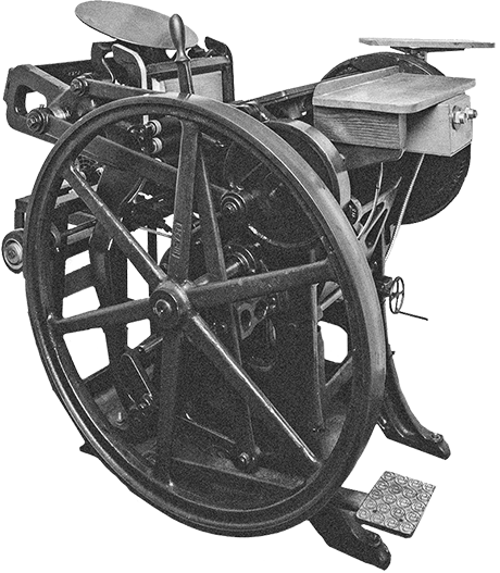
 We use rubber-based inks from Van Son and Southern Ink.
Cyan, Magenta, Yellow, Black
Widely utilized in the wide-format printing world is CMYK, which breaks down into cyan, yellow, magenta, and key (or black). You’re probably most nauseatingly familiar with this from your household inkjet refusing to print a black and white document because you’ve run out of cyan, causing a querying rant about why this machine needs blue to print black (interestingly, the addition of blue darkens a black, which is likely why pesky cyan is always out before anything else). And while CYMK is a combination of primary colors, and seems as though it could translate well to an analog environment, the process through which it’s created is wildly inconsistent, so reproducing consistent color over time is difficult. To create a CYMK color, the selected area is filled with a series of dots in each of the four colors mentioned at specific percentages, to arrive at what is perceived by the eye as a solid color. This dot pattern is not static, however, and the next time you select that same CMYK color, the dots will not necessarily populate in the exact same order, leaving room for variance. This method holds value for print jobs requiring wide swaths of color, and lots of them, but holds much less in the context of jobs requiring consistent hits of the same color over time, as with the letterpress process.
Red, Green, Blue
In modern discourse, hexadecimal color codes, informally known as "hex colors," reign as the most frequently cited color system. This color space is solidly in the digital realm, and certainly has its merits there. It’s a shortcut for RGB, and if you’re old enough, you can pull up the nostalgic memory of the red, green, and blue rectangles that used to make up color TV screens. An effective — if not lamentingly dated — visual representation of all colors being made of varying levels of those three. It offers a wide range of colors, but its utility is exclusively digital. There are no weight-ratio recipes available to deconstruct a HEX code into the perfect combination of red, green, and blue ink. And while it’s relatively precise, the wide disparity between screen displays (up to 10% from monitor to monitor) can make screen matching a challenge. Even with the best calibration, it leans subjective.
PANTONE® Matching System
We like specificity. Enter Pantone, which publishes a series of what are called “spot colors,” which are a single, solid colors of ink, comprised of varying combinations of 13 in-house colors. Whereas other color space systems are made of three or four base colors, the Pantone system utilizes 13.
 A fanned out Uncoated Pantone Solid Formula Guide containing color recipes.
This expansion in the “building blocks” so to speak, of spot colors, allows for much more precision and specificity when selecting and mixing. These spot colors are numerically coded, creating a universal language through which color can be discussed, in an unbiased, uninfluenced, and pure way across language, culture, and all stages of design. Each spot color formula is based on ratios of weight, so armed with our trusty gram scale, we are able to mix your exact color, exactly right, every time. Re-orders are guaranteed to match the first run, as we archive your Pantone number with your order. Brand colors are guaranteed to be accurate if we are all using this brilliant common language created for us by chemist Lawrence Herbert in 1963. Sixty years of the Pantone Matching System and it’s as relevant today as the day it first launched, with an ever-expanding catalog of spot colors to mix. Currently there are 1,867 in the Standard Pantone Uncoated swatch book, the book we mix and match to (we print exclusively on uncoated paper to ensure a good impression and even coverage). There are various other Pantone systems with their own color codes for printing on different surfaces (coated paper, fabric, neon and metallic, etc.) each with their own quantities of spot colors.
 Ben is weighing ink on a gram scale to achieve a specific Pantone color.
 Ben begins to mix a combination of yellow, mixing black, transparent white, and rubin red.
We take a lot of pride in what we print at our little press. We custom mix our black to give it the punch and depth we love to see contrasted on our creamy, cotton paper. Our templates designed with specific colors (like the Investigator or Representative), have their own Pantone code associated with them so that we know every time one is ordered, we’re able to print the exact mid green or dark blue you expect to see when you unwrap your cards. When we get a custom order with a pantone code provided, it makes our day. We know that we can provide the exact color you request, without a questionable CMYK to pantone conversion, or a subjective HEX to spot color screen-match. There’s zero margin for error, no perception bias, and the certain screen display discrepancies between yours and ours cease to matter.
 After the ink is mixed, it's applied directly to the ink disk using an ink knife.
Gauguin famously referred to color as a “deep and mysterious” language, which it certainly is (and don’t we love that dreamy mystery in art and nature), but finding specificity and satisfaction in design through a common color language is worth its weight in (for us) rubber-based pigment, precisely measured and spread on the ink plate.
Thanks for Reading!
We not only love writing about letterpress, typography, and design – we're printers ourselves! We've chosen to carry on the tradition of letterpress printing by offering beautifully pre-designed cards at affordable prices.