The Prospector

Description
The Prospector, also available in a vertical oriented version, is a well balanced left justified card split into two columns, making it easily adapted to accommodate different lengths and amounts of contact information. The name font, set in Quarto Bold, gives this card a striking look. Its glyphs are very heavy, but also well contrasting and unique among other display typefaces. The info text is set in Assistant, which adds great legibility and balance.
Specifications
- U.S. Standard size (2" x 3.5")
- Reich SAVOY®, Natural White, 100% cotton paper
- Black ink
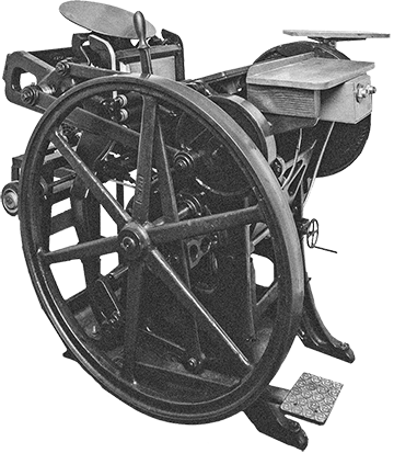
- Hand printed on a 1945 Chandler & Price Letterpress
Bulk Order Discounts
If you're ordering for more than one person, bulk order discounts are automatically calculated in your shopping cart. Add multiple orders to your cart and these discounts will apply:
| 2 Orders | 10% Discount |
|---|---|
| 3 - 5 Orders | 15% Discount |
| 6 - 9 orders | 20% Discount |
| 10+ | 25% Discount |
Adding a Logo?
Our calling cards at Hoban Cards are purposely designed to be minimal and use beautiful typography as their main design element. However, we also help customers customize these templates further with added logos, specific typefaces, or fully custom layouts. If you have your own layout, or need us to help you design one, get in touch for a quote.
Request a Quote
Why Letterpress Printing?
Put simply, letterpress printing is a form of relief printing, where the text or image is on a raised surface, similar to a rubber stamp. Ink is applied to the raised surface and then paper is pressed directly against it to transfer the text/image. Learn More.
Save on Reorders
We create a unique letterpress plate for your order and keep it in our shop in case you want to reorder in the future. Reorders receive 20% off the original price.
See the Action
Our team of three have been printing these simple letterpress cards for over 10 years. As much as we love paper and ink, we equally love our turn-of-the-century letterpresses. See the full video.
