Putting Pen to Paper: Victorian Era Stationery
by Claire Green -“The most fashionable notes, like the most fashionable people, are characterized by an elegant simplicity.” -Willis Westlake, How to Write Letters (1876)
Handwritten notes and letters reached peak popularity during the second half of the 19th century. It was truly an art form, shrouded in strict etiquette (what wasn’t during the Victorian era?) and common practice for many middle and upper-class men and women. This post sets aside most of the etiquette and briefly outlines what Victorian era stationery actually looked like and what it was used for.
We love handwritten notes and well-made stationery. Especially now, when it’s easy to go months only reading messages from friends and family on a screen, a thoughtfully crafted handwritten note can really be something special. We’re proud to offer a variety of notecards and stationery sets featuring contemporary designs, but we’re also interested in the traditional stationery items of times gone by. So, in this post, we’re going to take a look at some historical notecards and other interesting epistolary items.
 Stereograph image showing a Philadelphia stationery shop's interior with shelves and glass cases of goods for sale.
Personally, I love the history of reading, writing, and all that surrounds it. Learning about the history of typography, papermaking, bookbinding, and of course, letterpress printing is my idea of a good time. The phenomenon of Victorian letter writing is an interesting topic and one I recommend checking out. The intense etiquette is fascinating, but I recently found myself wondering what exactly all those Victorian people were writing so many letters on? Was it simply plain white 8.5” x 11” paper and black ink? My hunch was no, but I really wanted to find out more. Luckily, I came across a handful of insightful writing and etiquette manuals from the 1870s through the 1890s, which offer a glimpse at traditional stationery of the times. Read on to learn more about the styles of letters and notecards used during the late 1800s.
Paper
The color of paper has changed quite a bit over the decades. Earlier in the Victorian period, colored and lightly tinted (and even scented) papers were fashionable, and mostly, if not exclusively, used by women. Floral embellishments, fancy finishes, and edges lined in gold, silver, or other colors were also in trend in the earlier years but fell out of fashion in favor of simple family crests and monograms. By the 1890s even those embellishments were considered to be in bad taste for most circumstances. One thing that everyone seemed to agree on, no matter the year or occasion: high quality plain white or cream paper in a nice thick weight was always the most elegant choice. “There is a fashion in letter-paper and envelopes which is ever varying as to size and shape—sometimes small, at other times large; now oblong, now square; but one thing never alters, and that is the desirability of using good thick paper and envelopes, whatever the shape may be” (Lady Gertrude Elizabeth Campbell, Etiquette of Good Society, 1893).
For personal correspondence, note-paper was used. One very popular size was the commercial note, which is slightly larger than today’s A7, at about 5” x 8”. This size was used for longer letters, and by men for most of their letter writing (men also used the larger packet note size of 5 ¾” x 9”). Shorter, more casual notes (presumably favored by women) were written on a smaller sheet size, called the octavo (7” x 4 ½“). An even smaller paper size called the billet (6 ⅛“ x 4”) was used for invitations and responding to invitations.
For either men or women’s stationery, the best letters were kept simple, with the focus on high-quality paper and excellent penmanship. One author goes as far as to say “Both paper and envelopes should be of fine quality. It conduces to fine penmanship, and perhaps inspires the writer with fine thoughts. Coarse paper, coarse language, coarse thoughts, — all coarse things seem to be associated” (Willis Westlake, How to Write Letters, 1876). Though he might be a bit dramatic, we at Hoban have to agree with Westlake that there is beauty in simple, minimalist design.
Envelopes
No matter what style of letter or note paper was used, the envelope must always match. Sometimes two envelopes were used; the inner envelope would be made of the same paper as the letter, and the outer protective envelope would be a bit hardier stock, sometimes in a buff color. Envelopes were sealed with wax up until the end of the century, and while women could use a variety of colors such as gold or blue, men could only use red. Black wax was used if the writer was in mourning. By the end of the 1800s, gummed envelopes replaced the need for wax.
Pen and Ink
Black ink was always a good choice, and by the end of the century, anything else was seen as distasteful. Some earlier passing trends allowed for women to write in colored inks, with violet being a popular choice for some time. Quill pens were not as common as steel pens, but they were still used by some of the more talented writers. The stub pen was also viewed as a good choice for someone with the skill to wield it gracefully. From what I read, it seems like the type of pen used wasn’t nearly as important as the neatness, elegance, and grace of the penmanship.
Business Letters
Business letters were commonly written on an 8” x 10” or 9” x 11” size sheet of letter-paper. The paper could be lined or not, but unlined paper was considered to be the most tasteful choice as it gave the writer more creative freedom and demonstrated the writer’s skilled and controlled penmanship. Letterhead often came in tablets of 100 sheets and had printed headings, with monograms coming in and out of fashion over the decades. All in all, standard business letters haven’t changed much in size or format for 150 years!
Mourning Stationery
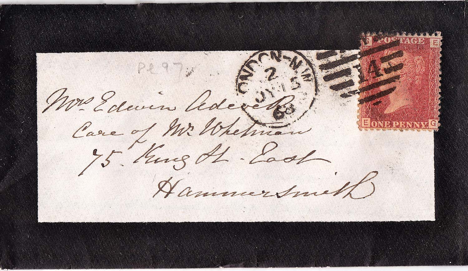
Perhaps the most Victorian of all the Victorian letters is mourning stationery. Death and especially early death was a common occurrence in the 1800s, and mourning the dead was a way of life during the Victorian era. Being in mourning not only dictated what you wore and did (and didn’t do), it even determined what type of letters you sent. Mourning stationery had a black border around the edge of the paper and the envelopes. The distinctive envelope served a couple good uses. It notified the letter carrier of its somber and important contents, which encouraged extra care and protection during transit. Similarly, it gave the recipient some warning of the news it held, giving time to sit or find privacy before reading.
 An example of a black bordered mourning stationery envelope. source with permission.
But mourning stationery wasn’t used just for death announcements, it was also used for all letter writing the bereaved did in the year or two after their loved one’s death. Even the thickness of the black border could indicate important information about the loss. In some cases, the closeness of the relationship between the writer and the deceased would be conveyed through the width of the border. For example, a mother mourning the loss of a child would have a thicker border than if she were mourning the loss of a cousin. In some cases it conveyed to the reader how much time had passed since the death occurred, starting with a thick border early in the mourning period, and gradually thinning out over the course of the year or years. However, these social rules varied over time and geographically, and eventually gave way to most people using simple, thin bordered stationery for all mourning purposes.
To boil down and oversimplify a lot of American history, letter writing was so popular during the second half of the 19th century due to three main factors. Literacy rates were higher than ever, mail could be delivered quickly across large distances thanks to the newly completed rail system, and the invention of the postage stamp made sending mail more affordable to all classes. After the turn of the century, much of the stationery that people used was plain and uniform, and greeting cards and postcards started to gain popularity. Over time, telegraphs, radio, and the telephone made letter writing as a primary method of passing news obsolete (except during war, where letter writing remained very popular throughout the 20th century).
For these reasons, it’s clear that the Victorian era was truly the pinnacle of letter writing, at least in American history. And though letter writing today is certainly not the most efficient way to spread news or make an announcement, it has certainly stood the test of time. We still often send wedding invitations, birth announcements, letters of condolences or congratulations, and birthday cards in the mail with care. When we do take the time to handwrite a friendly note or quick letter, it is always received as something special. The physical nature of the notecard, the quality of its paper, the writer’s distinct penmanship, and the fact that it’s the only copy in the world just like it, all make the reading experience more personal, special and unique. If you haven’t sent a handwritten note for a while, perhaps it’s time!
Sources
- https://www.historymuseum.ca/cmc/exhibitions/cpm/catalog/cat2105e.html (accessed 11/9)
- http://www.victorianweb.org/technology/letters/condolence.html (accessed 11/9)
- http://www.deathcare.com/2009/mourning-stationery-long-history.html (accessed 11/9)
- https://postalmuseum.si.edu/research-articles/letter-writing-in-america/letter-writing-as-art
- https://www.brainpickings.org/2012/12/21/how-to-write-letters-1876/
- Westlake, J. Willis. How to Write Letters. Philadelphia: Christopher Sower Company, 1876 (Public Domain, digitally via Google Books)
- Campbell, Lady Gertrude Elizabeth. Etiquette of Good Society. London: Cassell and Company Ltd., 1893.
- Benham, Mrs. Georgene Corry. Polite Life and Etiquette; Or, What is Right and the Social Arts. Chicago: Louis Benham & Co., 1891.
- Eaton, Arthur Wentworth Hamilton. Letter-Writing: Its Ethics and Etiquette. New York: Frederick A Stokes, 1890

Thanks for Reading!
We not only love writing about letterpress, typography, and design – we're printers ourselves! We've chosen to carry on the tradition of letterpress printing by offering beautifully pre-designed cards at affordable prices.