The Business Cards of American Psycho
by Claire Green -Over the years of designing and printing business cards and calling cards, there is one famous card that is referenced time and time again. This card’s celebrity status comes from a three-minute movie scene and is visible for about four seconds, yet it has become one of our most requested cards.
The card we’re referencing is, of course, Paul Allen’s Pierce & Pierce business card from the 2000 horror/thriller film, American Psycho. We’re going to take a closer look at the design of this simple business card, along with the other four cards featured in the film, and try to distill why it remains such a popular and beloved card.
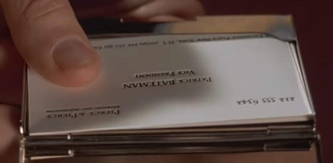
Patrick Bateman
We’ll start in order of appearance, with Patrick Bateman’s business card. His card is a close second in popularity to Paul Allen’s and is a style we’ve printed by request numerous times. According to the film, Patrick’s card is printed on “bone” colored paper, and is set in a fictional typeface called “Silian Rail.” The actual typeface appears to be Garamond Classico SC (small caps). There are a few problems with Patrick’s card: the type is set off-center, painfully far to the left edge. It is also set too low so that the tight lower margin of the card is out of balance with the much larger top margin.
This gives the card an unhinged appearance, which might speak to the character’s mental state (though we’ll try to steer clear of film and character analysis here and stick to talking about the cards). In addition to the card being out of register, there isn’t a space between the ampersand and “Pierce” in the company name at the top right. Finally, Patrick’s card has a typo that is shared with the other four cards: all incorrectly spell the word “acquisitions” by omitting the c.
 Patrick Bateman’s Business Card from the movie, American Psycho (2000)
Oblivious to the card’s design issues, Patrick proudly shows it off to his colleagues and is met with mild praise. Let’s humor Patrick for a moment and consider the strengths of his card. For one, his card is clearly letterpress printed. When the card is shown at a certain angle, you can see the impression made in the paper. Also, Garamond style typefaces are respectable, timeless classics that remain popular through not only the decades but the centuries (you might recognize a Garamond in the Abercrombie & Fitch logo, or when reading a US edition of the Harry Potter books). The print quality and the chosen typeface are traditional and professional selections, though it’s unfortunate that the other design problems distract so greatly from the card’s stronger aspects. (Update: We've decided to create our own corrected Patrick Bateman card as a calling card template)
 Angle showing the signature letterpress impression into the paper stock
David Van Patten
David Van Patten is the second character to show off his business card. Just like Patrick’s, his card is set off-center, though too high this time, so that the bottom margin has too much white space and the top is too tight. David describes his card as “Eggshell with Romalian type,” but are in fact printed on heavily textured uncoated paper and set in Bodoni. Though his card is set too high, it is at least centered from left to right, which gives it a slight advantage over Patrick’s card.
One shortcoming is that David’s card isn’t letterpress printed, rather it is conventionally printed (presumably offset, since there weren’t digital printing options in the 1980’s). This means his card is printed flat and lacks the tactile quality of Patrick’s card, though he tries to compensate with the textured paper. Overall, his card has a more modern feel than Patrick’s, due mostly to the typeface selection, but the paper texture also gives the card a solid 80’s corporate vibe.

Timothy Bryce
Third up is Timothy Bryce’s card. He introduces it by saying “raised lettering, pale nimbus white.” Right off the bat, it’s clear that the lettering isn’t raised or embossed. The card appears to be letterpress printed, though we don’t get a clear shot of the impression depth. The typeface is the ever popular and ubiquitous Helvetica, giving it the most contemporary feel of all the cards.
The only real flaw is that the card is set far too low, but otherwise looks pretty good. Timothy’s paper is also noticeably textured, though slightly more understated than David’s. As uninspired as his card is, the clean and almost anonymous feel that Helvetica lends is a good fit for the straightforward design as a whole. It’s as though this card knows that it is one of the flock and just does its best to look presentable, rather than stand out in any way.

Paul Allen
And at last, we arrive at the supposed Adonis that is Paul Allen’s card. Since Paul himself isn’t in this part of the scene to present his card, we don’t get a character description of the typeface and paper choice. We do, however, hear Patrick’s envious voiceover, “Look at that subtle off-white coloring. The tasteful thickness of it. Oh my God, it even has a watermark…”
Now let’s start by saying that there is no evidence of a watermark. His card is printed on a relatively smooth, uncoated stock, similar to but whiter than Patrick’s. The typeface is Copperplate Gothic (which incidentally is also the typeface used in the film’s title sequence). Though it is called gothic, the typeface actually has lovely subtle glyphic serifs, giving the card a distinctly 20th-century sensibility with more character than Helvetica offers (which is a true gothic or sans serif).
Paul’s card doesn’t appear to be terribly off center vertically or horizontally, making it the most confident of the bunch. The most unique aspect of Paul’s card is that the address, fax, and phone numbers are set on two lines rather than one long line spanning the length of the card. Overall, his card might be the cream of this particular crop, though none are particularly special.
[Update - We now offer this template.]

Luis Carruthers
Before we move on to talking about the primary four cards as a whole, we have to make an honorable mention to the often overlooked fifth card! This card isn’t part of The Business Card Scene but instead shows up about halfway through the movie. Luis Carruthers’ garish two color card stands out with the printing in green ink and gold foil. The green is registered well enough, but the gold is significantly out of register, hanging much too far to the left.
Another detail unique to this card is that Luis’ name is set with his last name first. His last name is set in all caps like the other four cards, but his first name is the only one to be set in title case. His card is the flashiest and most expensive but is executed so poorly that it really just looks outlandish and silly.
[Update 1/13/20: A reader let us know that the typeface used for Carruthers' card is Edwardian Medium Plain. Thanks for sharing that, Justin!]

As a whole, the cards are much like their owners: potentially appealing at first glance yet predominantly unoriginal and flawed. Patrick Bateman, David Van Patten, Timothy Bryce, and Paul Allen are similar in age, appearance, and dress and they all have the same job and variations of the same business card. Their cards follow the same basic layout, have the same contact information and title and are printed in black ink on off-white paper. The differences are mainly in the typeface, paper type, and degree to which the card is out of register. Typographically, Patrick’s card is an Old-style, David’s is a Modern, Timothy’s is a Sans Serif, and Paul’s is a Serif, which does give each card its own unique, though subtle, flavor.
Putting aside the technical errors and overall homogenous quality of the cards, what makes them so appealing? As mentioned earlier, we get many requests for American Psycho themed business cards. In fact, Paul Allen’s card is so popular that we eventually created our own calling card inspired by the original. We call it the Improved Paul Allen because we gave it an updated and polished redesign. We traded in the turn of the century Copperplate Gothic for the modernist sans typeface, Verlag, and cleaned up the kerning and overall balance on a UK sized business card. And we’ll let you in on a little secret—it’s our top-selling calling card!
So that brings us back to the question of why people love these cards. Some of it simply comes down to the novelty of their celebrity status, but we think it also has to do with the flexibility of the cards’ layout. All these cards manage to display a relatively large amount of information on a single sided card. The layout has a professional, familiar feel to it and is well suited in a variety of industries.
The focal point is on the name, without requiring the font to be overly large or ostentatious and it’s safely nestled inside all the desired contact and business information. In a word, it’s adaptable, and it might be this quality more than any other that makes this card so highly favored.
 Our own rendition of the Paul Allen card - the Improved Paul Allen
Thanks for Reading!
We not only love writing about letterpress, typography, and design – we're printers ourselves! We've chosen to carry on the tradition of letterpress printing by offering beautifully pre-designed cards at affordable prices.