Playing Favorites: Our Favorite Historical Typefaces (Part I)
by CLAIRE GREEN -
Here at Hoban Cards we work in a shop filled with antiques. Our 118 year old press still turns out custom printed cards every day of the week and even some of our “newer” tools and equipment hail from at least the Kennedy administration. In the spirit of embracing some of the history around us, today’s post takes a look at the typographical history in some of our calling cards. We love beautiful typefaces old and new equally, but digging into the history of the classics can be pretty interesting!
Futura
Classification: Geometric Sans Serif
D.O.B. 1927
As Seen On: The Kennedy Card, The Kennedy Notecard, The Kennedy Set
 Up close of The Kennedy Card, which features Futura with additional tracking (letter spacing).
We’ll begin with one of our all stars: Futura. This typeface is easily recognizable for its geometric letterforms, giving it a buttoned down yet trendy look. Futura was designed by Paul Renner, a German typographer and painter, in 1927. He wanted to create a typeface for the current age, something that would feel modern and forward looking. He pulled inspiration from Bauhaus-inspired geometric shapes as well as Roman lettering and traditional French Garamond typefaces (more on those later). This balance of avant garde and traditional qualities made Futura look both cutting edge and accessible. Futura was hugely popular – and widely imitated by other foundries – and along with its imposters, it dominated mid century graphic design.
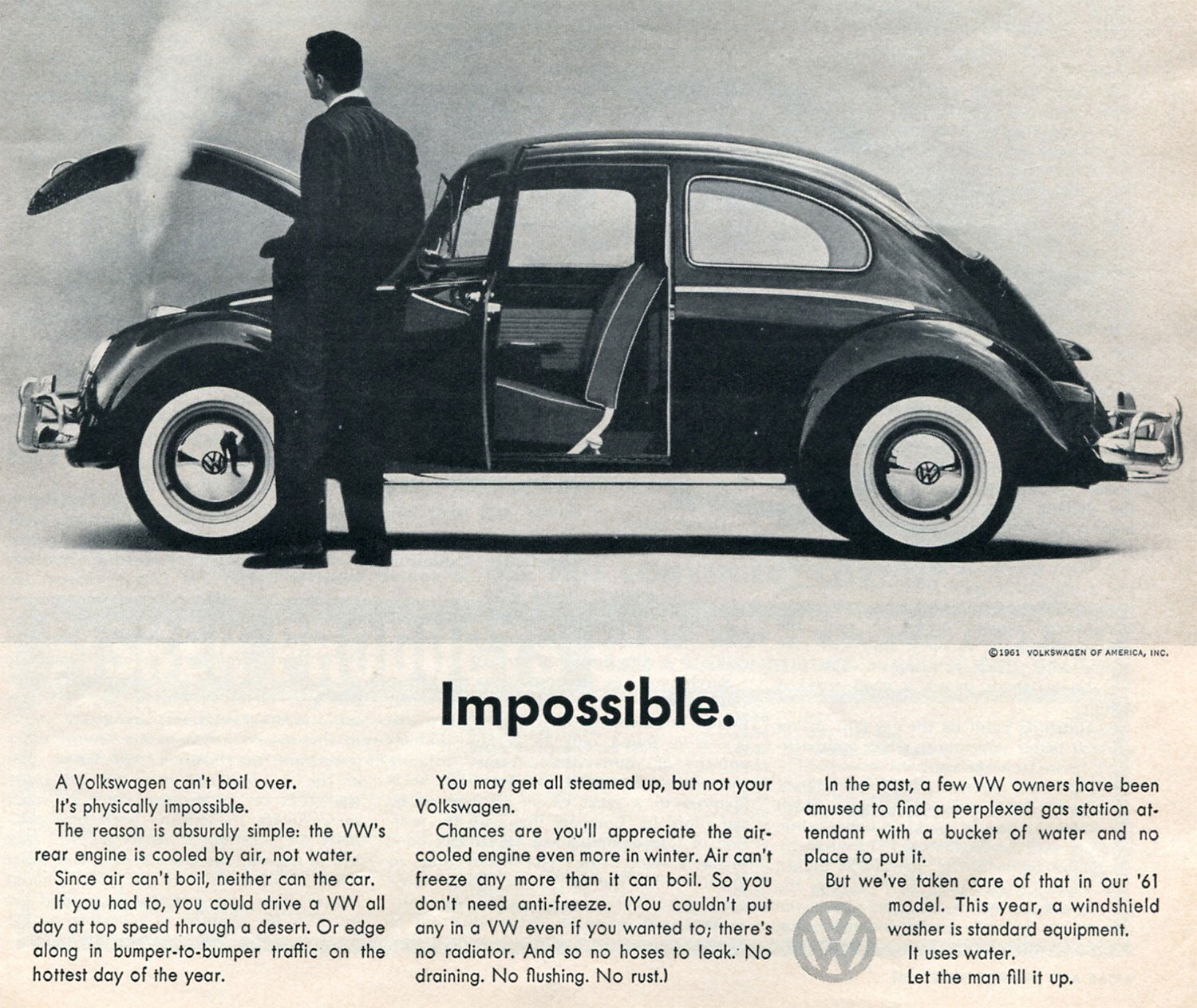 Volkswagen's use of Futura in their 1960s ads for the Beetle
If you’re thinking that Futura looks familiar, there’s a good reason for that. As one of the most used typefaces of the 20th and 21st centuries, it’s just about everywhere. The Futura font family (including combinations of its various fonts such as Light, Medium, Heavy, Bold, Black, Condensed and Oblique) runs rampant across big box stores and other retail locations. You can find it at Best Buy, Bed Bath & Beyond, Costco, Petsmart, K Mart, Claire’s, Forever 21, and Party City. It’s on cans of Red Bull and boxes of Domino’s Pizza. Futura can be all business on bland cautionary signage alerting you of fire exits, automatic doors, and private property. But it is equally at home in the fashion world; featured in logos for Calvin Klein, Dolce & Gabbana, and Louis Vuitton. Wes Anderson used Futura to give The Royal Tenenbaums set a cohesive treatment; it’s used in the title cards and credits throughout the film as well as sprinkled heavily throughout the set on buses, signage and posters. Richard Nixon used Futura in his 1972 reelection campaign. Nike uses Futura. Ikea used it until 2009, and Volkwagen was iconic for its use of Futura for the better part of six decades (it switched to a custom typeface in 2015). Pretty much everyone uses Futura – NASA even put it on the moon! There is so much to say about this typeface, and if you are interested in learning more, Douglas Thomas wrote a whole book about Futura’s history and usage, it’s a really fun and fascinating read.
Helvetica
Classification: Neo-grotesque sans-serif
D.O.B. 1957
As Seen On: The Helveticard and The Thin Helveticard
 Up close of The Helveticard, which features Helvetica Bold as the typeface.
Helvetica is a Swiss typeface designed in 1957 by Max Miedinger and Eduard Hoffmann. It was originally called Neue Haas Grotesk but was given a more marketable name when it was licensed by Linotype in 1960 (Helvetia is the Latin word for Switzerland). Helvetica is a revival of the unadorned “grotesque” san serifs of the 19th and early 20th centuries. These were popular workhorse faces used for signage and advertisements, such as Akzidenz-Grotesk, released in Berlin in 1898. As a “neo-grotesque,” Helvetica was designed with the same goals of legibility and clarity as the original grotesques, but with some idealistic pursuits as well. Designers in post-World War II Europe wanted to help build a better and more democratic society, and Helvetica’s creation aspired to these goals. It is an egalitarian typeface: all-purpose and lucid, neutral and forward-facing. It is neither fussy nor embellished; Helvetica is simply built to convey a clear message and not make a commotion while doing it.
Chances are, you know a bit about Helvetica already. Maybe you’ve seen the 2007 documentary about it (if not, you should!) or maybe you’re just familiar with it from sheer over exposure. Even though I just said Futura is everywhere, truly, Helvetica is absolutely everywhere.
 Subway sign in New York using Helvetica
If you’ve ever caught a train on the New York City Subway or the Chicago “L”, you’ve seen it. If you’ve ever filled out a tax form from the IRS you’ve seen it. Ever watched The Office? Helvetica is used for the title card at the beginning of every episode. Remember the NASA space shuttles? That’s Helvetica. Been to a Target, Sears, JC Penny, Crate & Barrel, Staples or Urban Outfitters? Helvetica. It’s all Helvetica. Auto companies especially love it. Toyota, Jeep, BMW, General Motors and Saab all use Helvetica. So does Nestle, MetLife, Run-DMC, Adult Swim, Tupperware, Verizon, Energizer, The North Face, Oral-B, The EPA, Panasonic and Skype. Look around you right now and see if you can spot it in the wild. Sitting at my desk, without even turning my head I can see it on the Scotch tape, a Pantone swatch book, a Sharpie, my mug, and even my keyboard! Keep an eye peeled whether you’re out and about or at home, and you’ll see Helvetica follows you everywhere.
Garamond
Classification: Old Style
D.O.B. 1530-ish (it’s complicated)
As Seen On: The Patrick Bateman
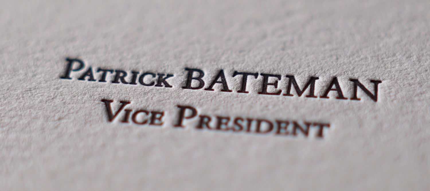 Up close of The Patrick Bateman card featuring Garamond Classico as the typeface.
At nearly 500 years old, Garamond is truly one of the greats. Though to say that Garamond is “one of” anything is misleading, since Garamond typefaces as we know them are actually revivals of a number of different faces, designed by different people. It’s a rather murky history, so I’ll just hit the main bullet points.
Claude Garamond (also spelled Garamont during his lifetime) was a 16th century Parisian type designer, punch-cutter*, and publisher who created a number of old-style serif typefaces. There were many other type designers working in France at the time, as this was a prolific period for type design, and many faces have been misattributed to Garamond throughout history. Garamond revivals became all the rage after World War I, and many big foundries started producing their own versions of “Garamond.” Eventually, it was discovered that pretty much everyone had been creating revivals of an entirely different typeface created by a French type designer named Jean Jannon who was active about a century after Garamond. So these early 20th century “Garamonds” by American Type Founders (ATF), Frederic Goudy, Monotype and Linotype were really “Jannons” but we still know them as Garamond today. Incidentally, the version of Garamond included with Microsoft Office is based on a Jannon design.
Another aspect to the Garamond confusion stems from the fact that despite his skill, Claude Garamond wasn’t financially successful. After his death in 1561 his widow had to sell all his equipment, punches and matrices to other publishers and printers. Because of this, his typefaces were widely used for two centuries, but without being properly identified as Garamond’s work.
Yet another reason for the confused legacy of his work was that Paris was a very competitive scene at the time, and piracy was not uncommon. Happily, some true Garamond material does remain for research purposes, with the primary collection being in the Plantin-Moretus Museum in Antwerp. Adobe Garamond, designed by Robert Slimbach in 1989, is a true contemporary revival, as it was based directly on the original Garamond materials in Antwerp.
 Apple's Think Different campaign featuring Apple Garamond as the typeface, which was Apple's own narrow version of the font.
Ok, enough history, let’s talk about Garamond (or perhaps I should say The Garamonds). As old-style faces, they are based on handwriting, but with a pronounced vertical design and more structure than organic pen and ink handwriting. They have an elegant and regal demeanor, without looking too extravagant. Garamond is at its best in print and thanks to its inviting legibility, is a popular choice for book publishers (ever read a US copy of Harry Potter? That’s set in Garamond.) You’d probably find the best examples of Garamond browsing through the fiction section of your local library, but you can also spot it in the Abercrombie & Fitch logo, Google’s original logo, and Apple’s “Think Different” logo from 1983 to 2001. Garamond typefaces are true classics that have stood the test of time, just ask Patrick Bateman.
*Punchcutting is the craft of cutting a letter by hand into steel as the first step of creating moveable metal type. The finished steel punch is used to stamp the letter into a copper matrix, which is the mould used to cast the metal sort. The metal sort is the finished product that is ultimately applied with ink and printed from. At Hoban we use photopolymer plates instead of traditional metal type, which you can learn more about in our blog post here.
The history of typography is a pet interest of mine; I love learning about the evolution of letterforms, how technology has shaped graphic design, and how political and social forces have directed typography’s development through the last 600 years. I could read and talk about it all day! This post is the first installment of a two part series – next I’ll be looking at the history of some possibly less famous but equally beautiful typefaces. Hint: they can all be found on our calling cards. We’ll see you next time, thanks for reading!
Sources
- Garfield, Simon. Just My Type : A Book about Fonts. New York, New York, Gotham Books, 2012.
- Thomas, Douglas, and Ellen Lupton. Never Use Futura. New York Princeton Architectural Press, 2017.
- Hustwit, G. (Director). (2007). Helvetica [Video file]. Film First Corp.. Retrieved October 23, 2020, from Kanopy.
- Simonson, Mark. “Royal Tenenbaum’s World of Futura.” Mark Simonson, 15 Nov. 2020, www.marksimonson.com/notebook/view/RoyalTenenbaumsWorldofFutura. Accessed 15 Nov. 2020.
- Loxley, Simon. Type : The Secret History of Letters. London ; New York, Tauris, 2004.
- Consuegra, David. American Type : Design & Designers. New York, Allworth Press, 2004.
Thanks for Reading!
We not only love writing about letterpress, typography, and design – we're printers ourselves! We've chosen to carry on the tradition of letterpress printing by offering beautifully pre-designed cards at affordable prices.